The Evolution of an Image
One of the most important things we can learn in photography is the understanding that the photograph captured by your camera is only the first stage in the evolution of the image. In fact, my preferred train of thought is to consider what the camera captures as the very building blocks, or raw materials, from which the final image will be created.
To show what I mean by this, I’ll step through the stages and the thinking behind the construction of a landscape taken at Sugarloaf Rock in Cape Naturaliste. The rock itself rises out of the ocean, surrounded by red rocky outcrops of the coast. Many photographers isolate the rock in their images, but I decided that I wanted to show the terrain of the coast around the rock and to use the rock as the background feature — the subject upon which our eyes rest once it has finished exploring the landscape within the image.
Original Raw File (as viewed in Lightroom CC)
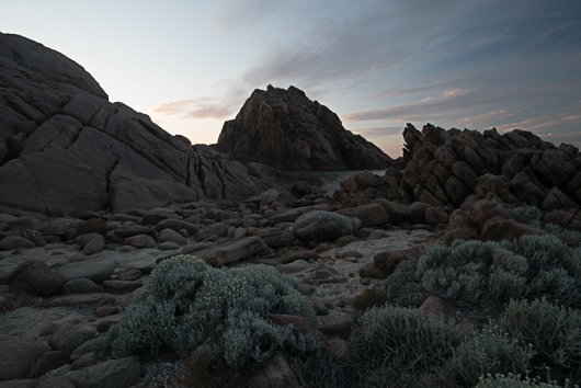
This is the Raw file as rendered by Lightroom CC. It’s typical of an image taken in backlit conditions — because the sky is much brighter than the foreground, I had to slightly underexpose the foreground in order to avoid losing detail in the sky. As a single-frame capture, it’s not very exciting (it lacks punch, colour, impact) but knowing what I know about the camera’s ability to record information in the Raw file, I can see the potential in this image; potential that will be unleashed when I use Lightroom’s Raw processing power.
Initial Lightroom Edits
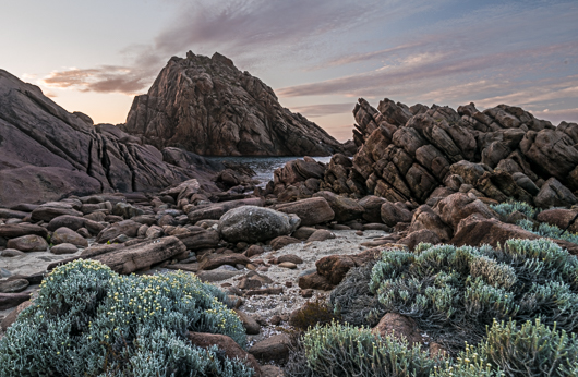
This image is the result of my initial editing in Lightroom — essentially balancing exposures, bringing back the highlights and bringing detail back into the shadows. I’ve cropped into the image as I felt that there was too much wasted space on the left that contributed nothing to the composition. I’ve also adjusted the colour temperature (white balance) to give the landscape a warm, post-sunset glow, with a hint of magenta in the sky. You can see the possibilities here — as it is, the foreground vegetation has started to pop out a bit more, showing more detail and texture. But the light around the rocky structures is still a little flat which makes the foreground more contrasty and attention grabbing than the mid and background. So, I need to work on this.
Local Adjustments in Lightroom
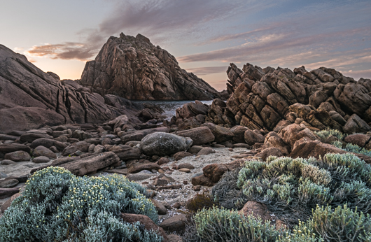
A good landscape needs to lead the viewer’s eye into the scene. This creates the impression of “depth” as well as provide a means by which the eye can enter and explore elements in the image. In order to achieve this, I need to create areas in the image where the eyes can rest. Using the local adjustment tools in Lightroom — the Gradient Filter, Radial Filter and Local Adjustment Brush — I paint light into the rocks, concentrating on the path that leads the eye from the plant in the lower left, to the outcrop on the right, and then along its jagged edge to Sugarloaf Rock. Adjustments in clarity, contrast, highlights, whites and dehaze help bring out contrast and detail that draws the viewer’s eyes into the frame.
Editing in Photoshop with Luminosity Masks and Colour Efex Pro
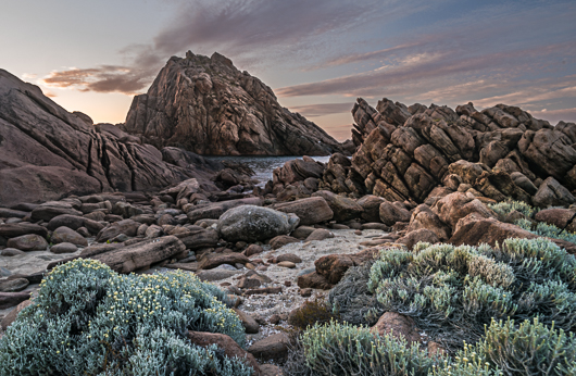
Once I’ve made as much use of Lightroom as I can to finish the image, it’s time to open it in Photoshop and to use the more refined post-processing tools available in Photoshop to complete the image. In Photoshop, I use Luminosity Masks to select areas to affect in the image — for example, selecting and working on the sky to recover detail there and enhance the colours of the sunset. I also used Luminosity Masks to select parts of the foreground and rocky structures to lighten, and to control shadow detail. I use the ADP+ Luminosity Mask Panel, created by my good friend and landscape photographer, Aaron Dowling. If you’d like to learn more about the ADP+ Luminosity Mask Panel along with hours of video you can watch, visit Aaron’s website.
I also use Nik Software’s Colour Efex Pro to enhance local contrast and to bring out detail and texture in the rocks, sand and foreground vegetation. Still using Luminosity Masks to select parts of the scene, I then mask in areas where these details need to be visible, while retaining the softer look in the sky and vegetation. Nik Software is now available for free, so you should definitely download it if you haven’t done so already.
Back to Lightroom and some colour grading
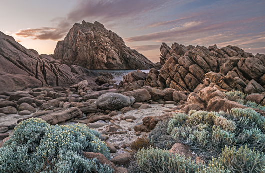
I’m almost finished with the image after Photoshop, save for one last bit of colour grading. Because the geology of this region has such a warm, orange hue to it, I wanted to infuse the scene with the same colour as the colour of the surrounding rocks. So, back in Lightroom, I use the Split Toning tool to add a warmer hue to highlights and shadows of the image. And it’s done. The image is ready to be exported — either for sharing on the Web or for printing!

No Comments